Responsive Font Sizes WordPress is now easier to achieve than ever before. Typography plays a crucial role in crafting websites that are both visually engaging and easy to read. With the release of WordPress 6.7 RC, users can fine-tune their site’s typography using the all-new Font Size Presets. This feature brings powerful, responsive font scaling controls right into the WordPress Site Editor.
As a result, creating a cohesive, professional design across all devices is now possible—without writing any custom CSS.
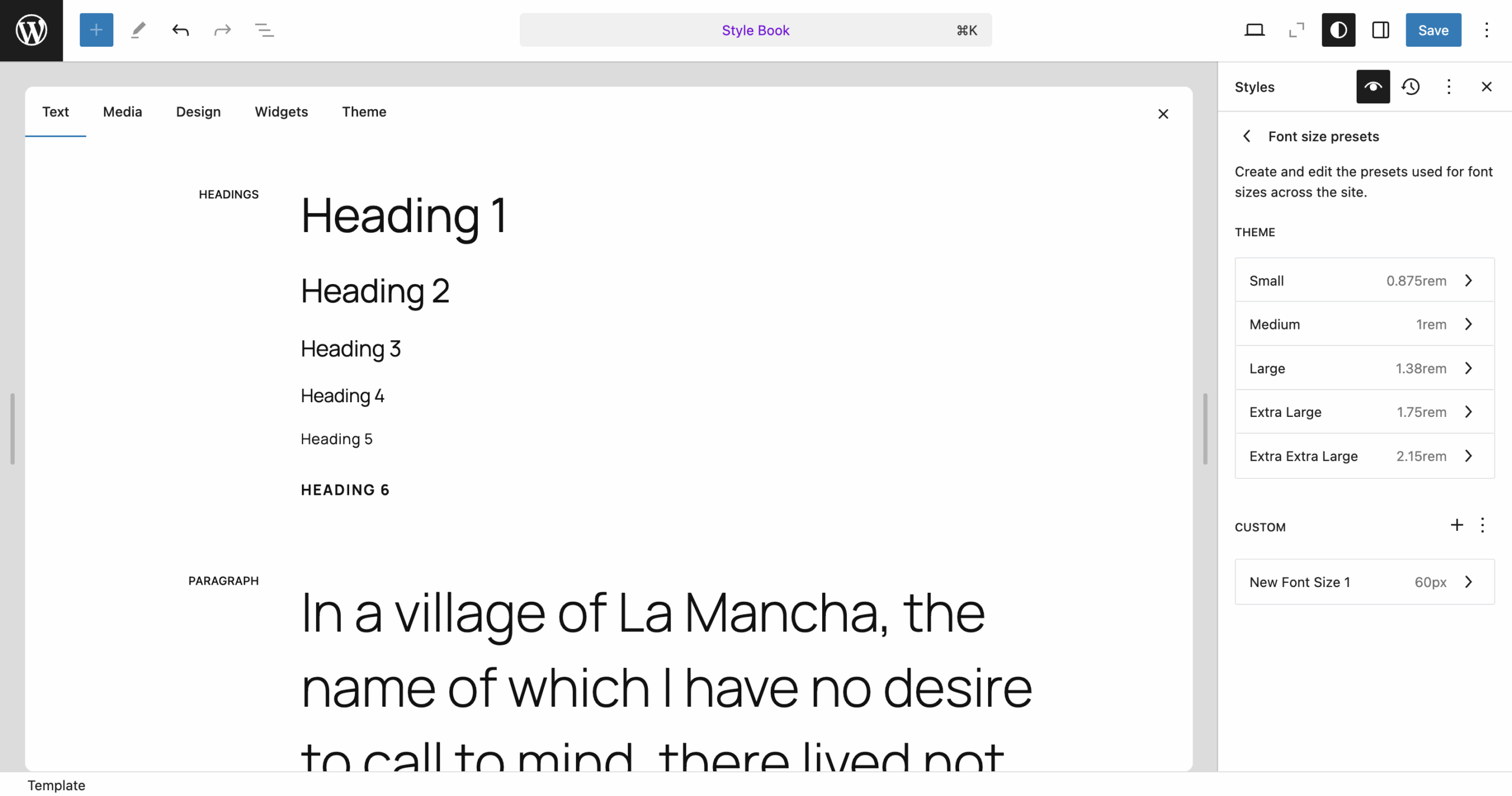
What’s New: Responsive Font Sizes WordPress Features
The latest Font Size Presets control simplifies how you adjust text sizes across your site. You can now choose from a set of predefined options, including:
- Small
- Medium
- Large
- Extra Large
- Extra Extra Large
Moreover, these presets are integrated with fluid typography, meaning your text will automatically adapt to different screen sizes. This ensures your content remains readable and visually consistent, whether viewed on a mobile phone, tablet, or desktop.
Flexibility with Custom Font Size Presets
Even better, WordPress 6.7 RC allows you to create custom font size presets. Therefore, you can design typography that perfectly matches your brand guidelines or design needs. Whether you want slightly larger headings or unique text sizes for specific elements, you now have full control.
How to use the font size presets for responsive font sizes in wordpress block editor
Let’s walk through how you can access and use these new typography tools:
How to Set Up Responsive Font Sizes WordPress
Following these easy steps, you can take full advantage of the new typography features:
1. Open the WordPress Site Editor
Firstly, log into your WordPress dashboard and open the Site Editor. Then, locate the Styles panel on the right side.
2. Access Typography Settings
Under Styles, click Typography. Here, you will find settings for fonts, font sizes, colors, and backgrounds.
3. Use the Font Size Presets
The Font Size Presets section shows various predefined sizes. Choose one, such as “Large,” to apply or customize it further.
4. Enable Fluid Typography
Next, toggle on Fluid Typography. Consequently, your font sizes will scale automatically depending on the viewport size, ensuring excellent readability on all devices.
5. Adjust Custom Fluid Values
For even greater control, set custom minimum and maximum font sizes for each preset. This way, your text remains perfectly balanced across small and large screens.
6. Add Your Own Custom Presets
Finally, to add a new font size:
- Click the + button in the Font Size Presets section.
- Name your custom preset.
- Define a default font size.
- Enable Fluid Typography.
- Set custom fluid values (minimum and maximum sizes).
Thus, you can create typography tailored specifically to your website’s design.
Try Responsive Font Sizes WordPress Instantly with WordPress Playground
Testing these features is simple with WordPress Playground. It is a browser-based, setup-free environment where you can preview your site’s design changes immediately.
Experiment with Responsive Font Sizes WordPress today, and see how fluid typography can dramatically improve your website’s design and user experience.
You can now try these new features using the 6.7 RC instance in WordPress Playground an instant, setup-free environment to test the latest features like fluid typography and font size presets. Experiment with responsive scaling and see how adaptive typography enhances device readability and design. Try it now to preview your site’s new look with ease! 🙂